


Revisiting the Energy Capital Cycle
Revisiting the Energy Capital Cycle
What trends have we incorrectly been transposing to the bullish thesis, and what does a healthy bull market look like going forward?

It’s tough to quantify what an "underinvestment in energy” really looks like — is it not enough short-cycle production, long-cycle development, refining capacity, midstream infrastructure — or all of the above? Relative to what baseline, what even is the proper baseline? There’s a lot to consider, and there is tons of noise, and too much fallacy when comparing, and drawing conclusions from the fragmented energy data we see.
My take is — there’s enough oil in the world, and likely will be for a good while.
This will be a fairly radical statement, especially presented to the audience I know it will reach, but I don’t think there has really been an underinvestment in energy, at least not to the point where owning most producer equities looks really appealing here (though the top quartile looks attractive as ever). You’ll have to keep an open mind while I explain, but I can assure you that you will come away with, at the very least, something to think about. I would propose the modern energy capital cycle is similar, but also structurally different than previous cycles. With an exaggerated spend in 2014, we don’t need to reach $1tn of upstream capital anytime soon to satiate global oil demand.
We’ve all seen the chart below, plastered on the front of every bullish oil circular. After narrowly missing a previous-cycle handshake with $1tn, upstream E&P capital spending is down from 2014, a lot (like 50% a lot), which obviously means we have underinvested in our oil infrastructure and we must gather as much leveraged exposure before the impending moonshot — or that may instead be a layman’s interpretation of the chart below. Without additional background you can really tell any story you want with it. I am going to provide that background.

I would posit that using 2014 as a baseline would be misleading, if not trite. 2014 by far was the heaviest capital year globally (60% higher than 2010) with the 2011 through 2014 period spending $700b more than the 2006-2010 run rate. That is a lot of capital spent. Though, overwhelmingly so, that capital was spent on finding and development (of course that would be expected given the subsequent jump in reserves) — in other words, the industry spent a ton of money on long-life projects, an abnormal amount of money. In 2006 the absolute F&D number would have tracked ~$150m, while in 2013 would have clocked in at ~$450m. While people have been relentlessly focused on the lack of capital expenditures compared to the previous cycle, you can make a strong point that during up cycles we build out large projects which we continue to expand, bolting on production at half-cycle economics through the trough of the down cycle. Not an entirely insane idea in of itself, and this isn’t to suggest that a resurgence in long-cycle doesn’t need to make a come back, but to me, that is a late 2020’s, maybe even 2030’s story. There is enough growth to last us until then. I take a more moderated view, after all, free markets tend to sort themselves out… eventually.

It’s true — as an industry we tend to add proved reserves in chunks at the beginning of a cycle as investment ramps, then keep them flat (while reserve life relative to consumption declines) through the cycle bottom. It’s no surprise then, in 2014, we saw a significant increase in global reserves after our little spending-frenzy.
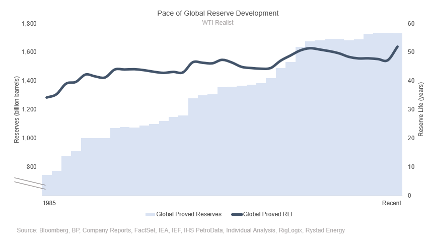
An imperfect measure, though directionally insightful — is adding back DD&A (Depreciation, Depletion & Amortization) to total capital expenditures in a given year.
I think of this as the amount of ‘value realized’ in any given year. While the trough between 2015-2019 certainly saw lower ‘total value recorded’, it is not nearly as dire as capital spending alone would suggest. Now, you can’t deplete forever, but the idea that in a cyclical sector, we don’t build out at the top and ‘harvest’ at the bottom is crazy — of course we are going to have fluctuations in capital spending as cashflow oscillates. Again, while DD&A is a more ‘fuzzy’ proxy for this, it gives buy-in-large validation to the idea that long life projects were built in the early 2010s and continue to be exploited through today

The idea of a cyclicality is nothing new. Semiconductors are an even more violent business than the oil business, with momentums changing every few years. Capital investment in semiconductors, and prior-year ROIC are very highly correlated, and just as one would expect, when you add back DD&A to capital spend, the ‘value realized’ is much less erratic than the below charts would suggest.

A few weeks back I posted this chart on my Twitter. It’s a simple chart, with a nuanced takeaway. While spending was down — better drilling processes allowed for less investment. We have majorly revolutionized lifting and drilling technologies over the past few decades, this is something that absolutely much be considered in absolute spending figures.

In Canada, the 2005 to 2014 cycle marked the development of conventional facilities, and oil sands projects; and lots of the capital went into building non-producing assets (like gas plants, pipelines, central processing facilities, etc.) that paved the path for development 2015 and onwards. While most of these companies don’t directly report it (though you can roughly estimate it through a handful of services, and area comps), majority of their capital today is DCET (drilling, completion, equipment, and tie in) capital, which allows them to add pads, and develop their assets with close to half-cycle economics.
Like the Duvernay gas plant that Crescent Point recently picked up from Paramount, who picked it up from Trilogy, or Whitecaps’ Utikuma gas plant they recently picked up from XTO Canada, which XTO received when they bought Celtic Exploration. All the built infrastructure is still on the map, whether the current operator was the one that sanctioned it.
All the batteries, pipe, and plants that Seven Gen built are still in ARC, same goes with Jupiter and Tourmaline. Journey and Tamarack both operate old Penn West infrastructure, and in the oil sands, Laricina’s remains can be found in CNRL, Petro Canada in Suncor, Renaissance in Husky, now part of Cenovus, and, Petrobank is, wherever that ended up — the point is majority of that infrastructure that we built, remains today.
It’d be tough to make the argument that when short-cycle shale took hold in the 2010’s that long-cycle investment remained the same, that’s not what I’m opining, in fact, long-cycle needs to make a resurgence, though perhaps in the same breath, this “underinvestment” theme is kind of played out. Maybe there was an over-investment of sorts in 2010 through 2014 that allowed us to continue to grow with less capital through the trough of the cycle. Our F&D and DD&A exercises above would serve to validate that theory — as people welcomed in $100/bbl prices in the 2010s, they brought their long-cycle reserves online, reserves that would produce for the next decade with very little capital commitment (that’s the greatness of a long cycle project, high upfront capital, lower sustaining costs).
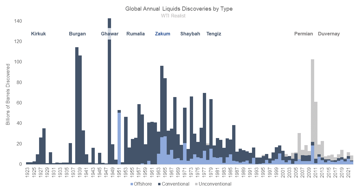
While the retort may be “exploration spending is way down”, I would suggest that, perhaps the reasoning is two-fold. While from 2000 to 2015, exploration capital as percent of total capital fell from 20% to 10% — exploration holes that came up dry fell from 80% in the 90s to ~40% in the 2010s, while 3D seismic technology was developed and implemented as we were leaving the 90s. We got better at exploration — that is a good thing. While we were exploring less, exploration was also yielding (relatively) less. Global discovered recoverable liquids grew just 8% between the 80s and the 2010s, and it wasn’t until the flock to the Permian that we really added a significant liquids discovery.

Most of humanity’s major oil discoveries came prior to the 1980s — while exploration was successful at replacing the prior year’s production through, say, 2010, more demand means that we either needed more exploration, or more impactful exploration. At least that’s consensus. We will revisit this later, but the interesting developments have come ‘behind-the-scenes’ in the form of better understanding of shale oils, enhanced recovery techniques, and offshore activity. Exploration is important, don’t get me wrong, it’s needed for a healthy market, but it’s not immediately crucial to the health of the world, or anything like that.
Though, for now — lets move onto another chapter — and as much as this may alienate the reader (I promise I will make this part quick) — renewables are a very real part of our power investment (note the difference between power and fuel), and while it’s true that the ERoEI (Energy Return on Energy Invested, definition here) is lower for renewables (though it has been improving), adjusting for renewable spending (it has to count for something) softens the “upstream capital has fallen off a cliff” narrative. That is all I will say about green energy — renewable power and travel at the minimum slows demand rate of growth. Even if you believe it’s full cycle more harmful to the environment than oil and gas development, renewable energy capital should absolutely be considered in some capacity when discussing upstream capital.

But what about those field declines — we need to replace those declines! The bulls will cry — as if production decline is something new…
It’s a bit of a busy chart, but focus on the bars one by one first (I have highlighted those 2018 and 2019 “degradation” bars oh-so-important to the bulls) and then capital spent, then capital efficiency (the takeaway though, is, US spent, US grew, ROW spent on gas, let oil decline — and using that to justify a continued ROW decline would be almost… vapid).
Let’s just run a scenario though. What’s our base decline? Well we lost 7mb/d through 2020 and spent $300m in capital that year. Lets say $150m was spent on production that year (we’ve established operators were buying equipment and were not bringing production on in 2020) and half of that loss what shut in (see how quickly it recovered the next year, we won’t mistake that as run rate efficiency). We get a -3mb/d decline at $150m spent. Now at an implied $80k/bbl capital efficiency, and $350m of excess spending ($500m spending in 2023 minus $150m in “base” from the above scenario) we get to 4.375mb/d of growth before declines, after 3mb/d of decline, we net ~1.3mb/d of growth in 2023. Even the laziest of the lazy oil zealots should be able to figure that out with some simple math. Declines are very real, but running a business to generate returns on capital is also a thing (shocking) — and you don’t do that by letting your production decline when the benchmark is $85/bbl (note below the implied efficiency numbers don’t back out declines or infrastructure, so may be highly variable year to year and are for directional/relative context).
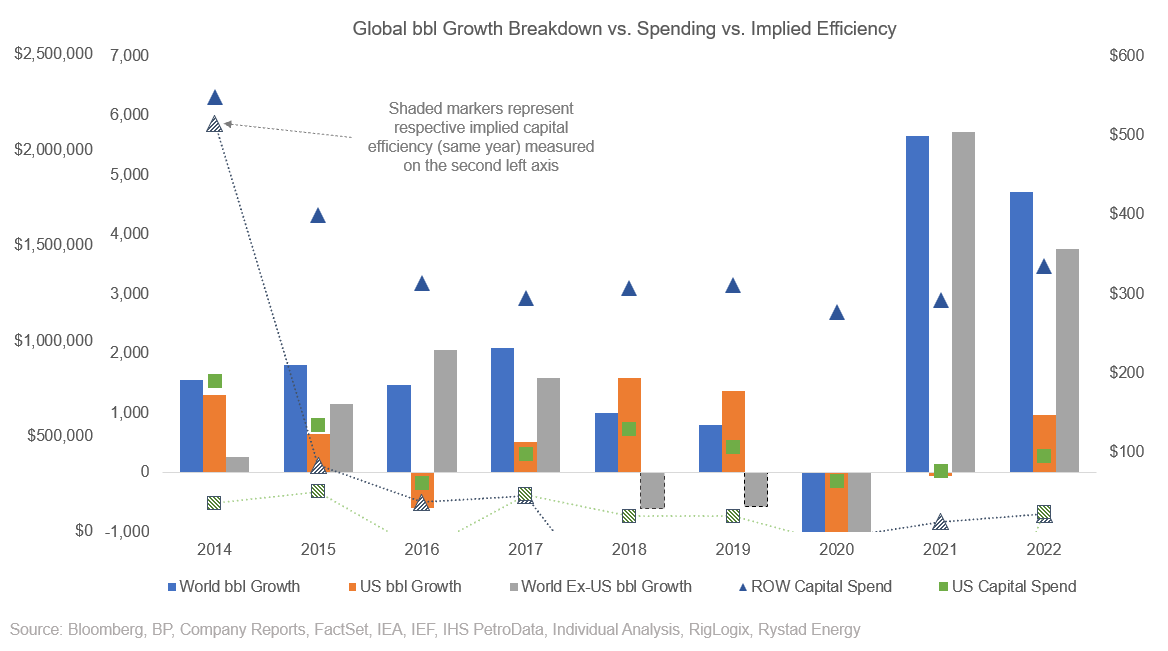
Then, if we focus on boe growth (including natural gas) — that 2018 decline is now growth, and the 2019 decline much less pronounced. Notice how quickly things jolted back internationally in 2021 and 2022. If you add another layer (total fuel growth) to this chart, the ‘boe’ story paints an even more telling picture of where our energy priorities were (note the past tense). All signs of a healthy market now that the majority of the liquids growth is outside of the United States. You can see (look at the orange vs. grey bars) the cataclysmic shift in who is driving the oil market go forward, and we can start to build that long life base again. The narrative of no growth from 2021 is crazy. We were bouncing back from a truly tumultuous market, of course there is going to be temporary dislocation.

Also imperative when discussing upstream capital slowdown (the whole base of the oil crisis narrative), is the product being targeted — natural gas, or liquids. LNG was the prom queen between 2015-2018, spot JKM was still trading in the $40-60/boe range, while oil was stuck below $50/bbl. It’s much cheaper to drill for gas, so on a unit margin basis, those with access to global markets (majors that also have significant liquids production) shifted their capital towards gas.
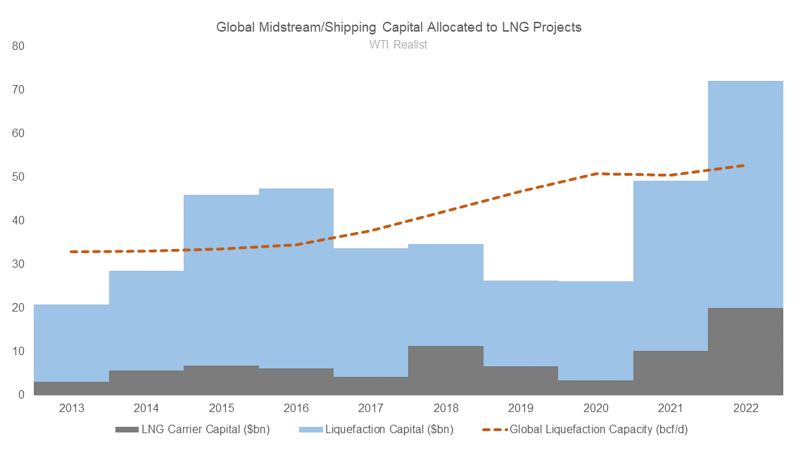
This, along with the number of liquefaction facilities approved (and contracted) in the prior years, meant that the gap between natural gas, and liquids growth was the widest it’s been in recent history. Generally, we have targeted natural gas during the cycle lows, and liquids at cycle peaks, with that relationship exaggerated 2015 through 2020 when LNG was a major global theme. LNG is not a major global theme again until 2025-2026 when the US begins to add trains. Ironically, this means the US is stuck drilling for gas, further deemphasizing the importance of the Permian as the main global liquids growth engine (and my god that’s a good thing).

Offshore natural gas made up the lion’s share of resource sanctioning, until 2019, when the price of Brent crested above $60, that magical offshore breakeven number. We wanted gas, cheap gas, and we contracted that gas for fat margins — it makes total sense that as profit seeking producers, the world rotated to focusing on natural gas while the US lit their money on fire in the Permian. This makes for a very, very compelling narrative that 2015-2020 global liquids growth (or decline) may be a bad figure to reference when deciding where the market goes next.

It’s easy to see this natural gas progression, and how it is going to affect the market today. Traditional liquids growth hubs like Russia and Africa let their oily projects decline in favour of natural gas for European countries (when has Europe ever not gotten their way in Africa), while Asia focused on meeting local gas demand and displacing coal. North America continued to grow liquids, and in 2019 with higher prices, the focus of the Middle East and South America shifted back to liquids.

The remaining 2/3 of this article is for founding and paid members. Please take advantage of the promotional offer below should you wish to support my publication.